We were adding a few new products to our documentation. The existing structure worked. It was clear, predictable, and easy to navigate, so there was no problem to fix. We could have added the new material, followed the same patterns, and moved on. Instead, the update gave us a chance to ask a different question: could one part of the docs do more than explain the product?
A demo inside the docs
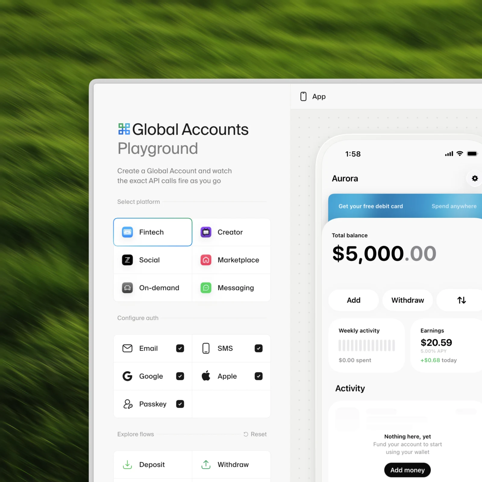
That question led us to build a working demo directly into the documentation. It sits alongside the written material and gives people another way to explore the same system. The documentation is still where someone goes for detail, accuracy, and reference. None of that changed. The demo is supplemental, useful in the moments when words and code samples might not tell the whole story.
Someone can move between six different product contexts and use the app. As they do, the exact API requests, responses, and webhooks appear beside it. Most documentation explains those two views separately, and there are good reasons for that. Each part needs room to be explained properly. Putting them side by side simply adds another perspective. It lets someone take an action in the product and watch the corresponding API activity unfold at the same time.
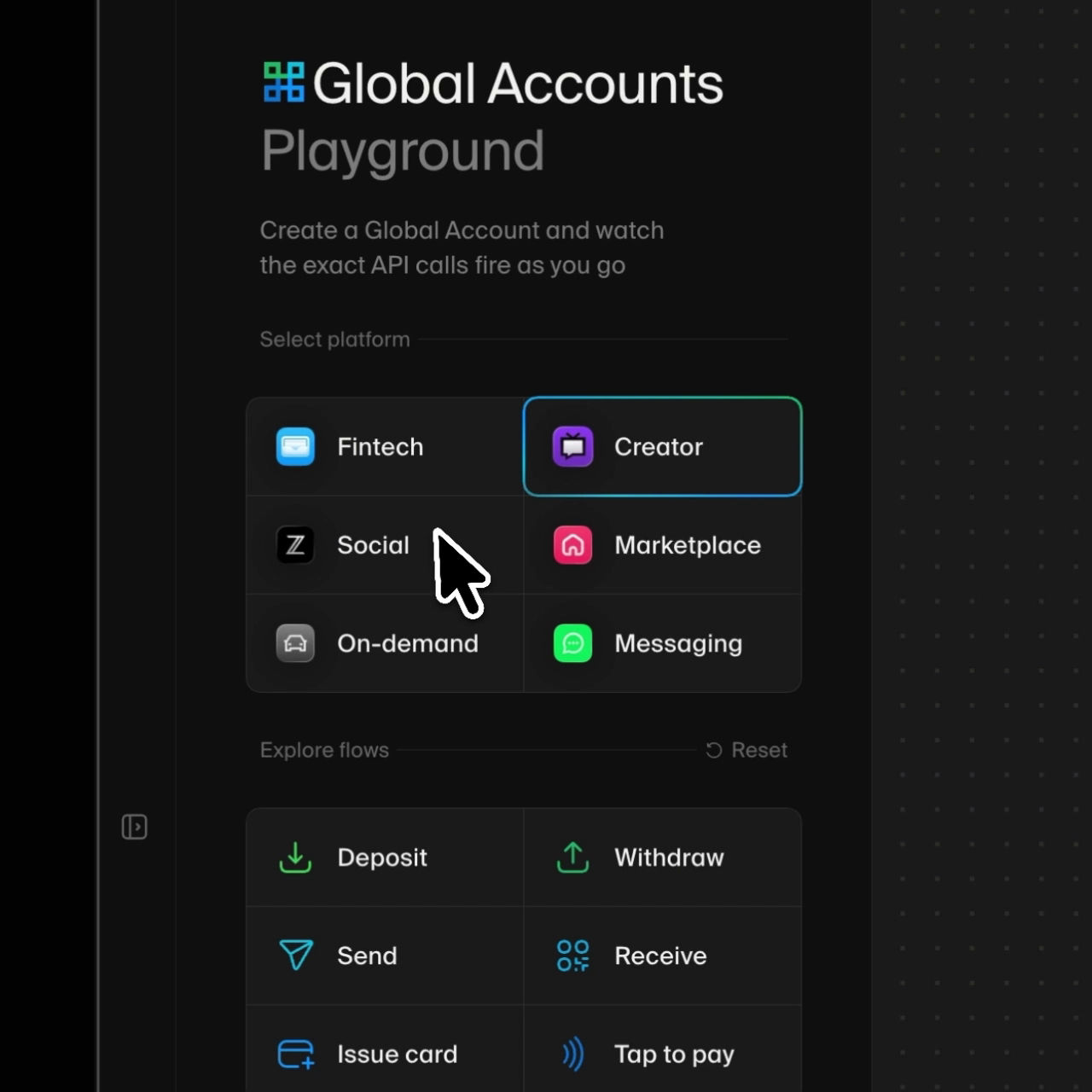
The information was already present in the documentation. The demo didn’t need to invent a new story or replace the material around it. It gave that material a way to play out in front of someone. That felt like a useful addition, particularly for a system with a lot happening beneath the surface.
Keeping what worked
There is often a temptation to talk about design work as if everything familiar needs to be reinvented. A convention is seen as a constraint, and a new idea has to replace the old one. That wasn’t the case here. The familiar structure still does most of the work. The navigation, written guides, code samples, and reference material are all where people expect them to be. Questioning the convention didn’t mean throwing it out. We kept what worked and pushed one part a little further.
Where AI fits
AI makes the role of documentation more interesting. Agents can already retrieve, summarize, and act on a great deal of written material, including pages that were never designed specifically for them. That does not make clear and structured documentation less important. It may simply mean that people arrive at a documentation site with different needs. Sometimes they need a specific answer or a reference they can return to. Sometimes they want to understand how the pieces fit together. And sometimes it helps to watch the system behave. The demo is for that last moment.
This is not an argument that every documentation site needs a working demo. Most documentation should remain straightforward. Adding interaction without a clear reason can make something harder to understand, not easier. This happened to be a place where the product and the API could be shown together in a useful way, so we made room for it.
The details carry it
The result depends on details that are easy to dismiss as secondary. The transitions, the different product contexts, and the way the interface and API trace respond to each other do not change the underlying information, but they shape how the experience feels and how easily it can be followed. That kind of care is often invisible when it works, which may be why it is so easy to undervalue. Five of them, up close.
Six apps, one system
1:1 with iOS, including liquid glass
Real iOS transitions on web
contentTransition(.numericText()).Bespoke animations for issuing the card
Fluid motion
Tools and models
For the curious — this is what the work actually ran on.
- Design
- Figma — flows, comps, and the card art
- Motion
- Motion — the springs behind the pushes and sheets
- 3D
- three.js — the Z card
- Build
- Cursor — Next.js and TypeScript, deployed on Vercel
- Models
- Opus 4.8 and Fable — wrote the code, read the drafts
- Docs
- Mintlify — the host the demo lives inside
- Capture
- Screen Studio — every recording in this post
What we learned
Some of this went smoothly. Some of it did not. A few things we would tell anyone trying something similar.
The demo is a second product
It looks like a page in the docs, but it carries the obligations of an app: it has to work, stay current, and match the API it claims to show. We signed up for maintenance, not just a launch.
We were guests in someone else's platform
The docs run on Mintlify, which we don’t control. Custom code loads after the page paints, styling hooks change between versions, and every workaround has to survive their next release. Building inside a host you don’t own means designing for the parts you can’t see.
Real shapes or nothing
The first version of the trace used tidied-up sample data, and it read as fake immediately. Documentation spends years earning trust; a demo can spend it in seconds. Everything in the trace now mirrors what the API actually returns.
Knowing when to stop was the hardest part
Every corner we polished revealed another one. At some point the demo was good enough to ship and easy enough to keep improving, and that had to be the bar — not done, just honest.
The lesson is fairly modest. We didn’t replace a broken system. We took a familiar surface that was already working and asked what else it might do. Most of it stayed the same. One part went a little further. Sometimes that is all questioning a convention needs to mean.
Comments
Add something we missed, ask a question, or disagree. Just be cool.