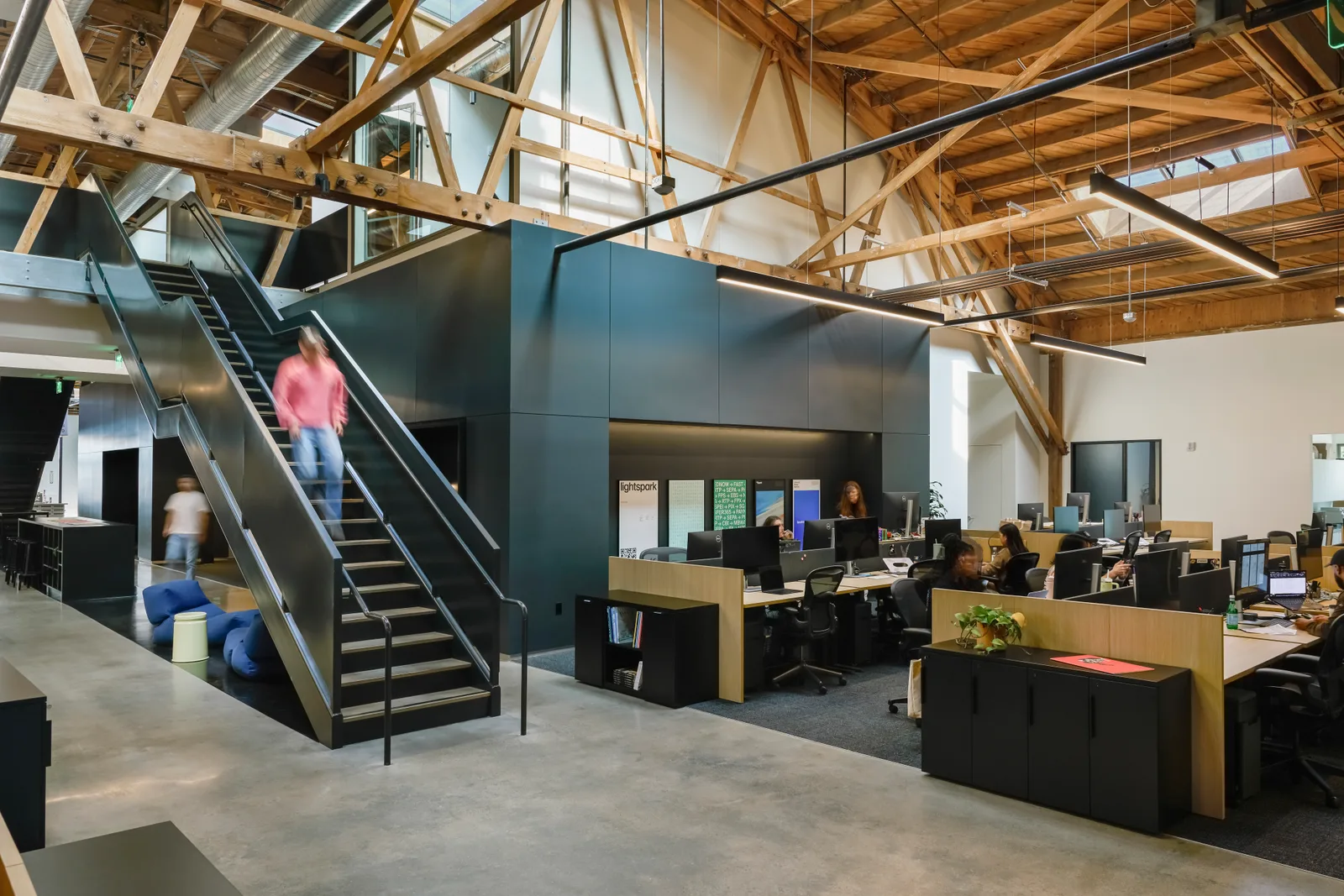
Our design team at Lightspark has a standing meeting most mornings. We call it design sync. The name makes it sound a bit like a standup, but nobody goes around the room reporting what they’re working on. We look at the work itself, pull it apart, and help each other make it better.
Design sync takes the place of 1:1s, weekly crits, and a lot of the one-off meetings we’d otherwise need. That leaves the rest of our calendars pretty clear.
The meeting is on the calendar, but we don’t hold it just because it’s there. Someone usually pings the group in the morning to see if there’s anything worth discussing. Mostly there is. Sometimes there isn’t.
When we meet, it might take ten minutes. We look at what people are working on, see if anyone wants or needs help, and get on with our day. Other times, we spend an hour or more pulling apart a problem, critiquing a piece of work, or designing something together on the spot. There’s no fixed agenda, and nobody has to manufacture an update.
Because we meet often, nobody has to wait a week to share something or schedule another call when they need help. We stay close to one another and to the work, then leave as much of the day as we can for actually doing it.
The useful part is everyone in the room. We can tell someone the work isn’t there yet, help them figure out why, or notice when they need encouragement more than another opinion. Occasionally, something said in the room sends the work in a completely different direction.
Marketing is in the room
On Mondays, Griffin joins us. He leads marketing and has been doing this kind of work for a long time. We trust his taste and his judgment about positioning, communications, and what the business needs. He trusts us with much of the execution because that’s where we have the skill and capacity.
I’ve seen design and marketing drift into different worlds at larger companies. The teams have different goals, pressures, timelines, and sometimes very different taste. When each side only sees what the other one produced, the relationship gets harder than it needs to be.
Having Griffin in the sync helps us avoid some of that. He can introduce a project, add context, and tell us what deserves attention while the work is still taking shape. He also sees how we get there. He hears the critique, direct but never personal, and sees how much thought can sit behind a decision that looks obvious once it’s finished. We get a better view of his side too. That time together has built a lot of trust.
We’re looking at the same work early enough to make it better together. Between meetings, we need a way to remember where everything stands: what’s moving, what’s changed, and what needs our attention next.
A Google Sheet was enough
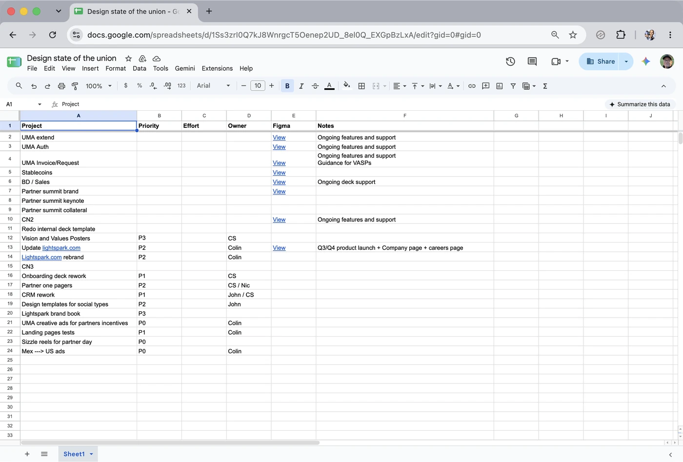
Lightspark was still early, so we used whatever got the job done. I made a Google Sheet with a list of projects, some basic context, and a place for notes. Nothing special, but it was enough.
Google Sheets
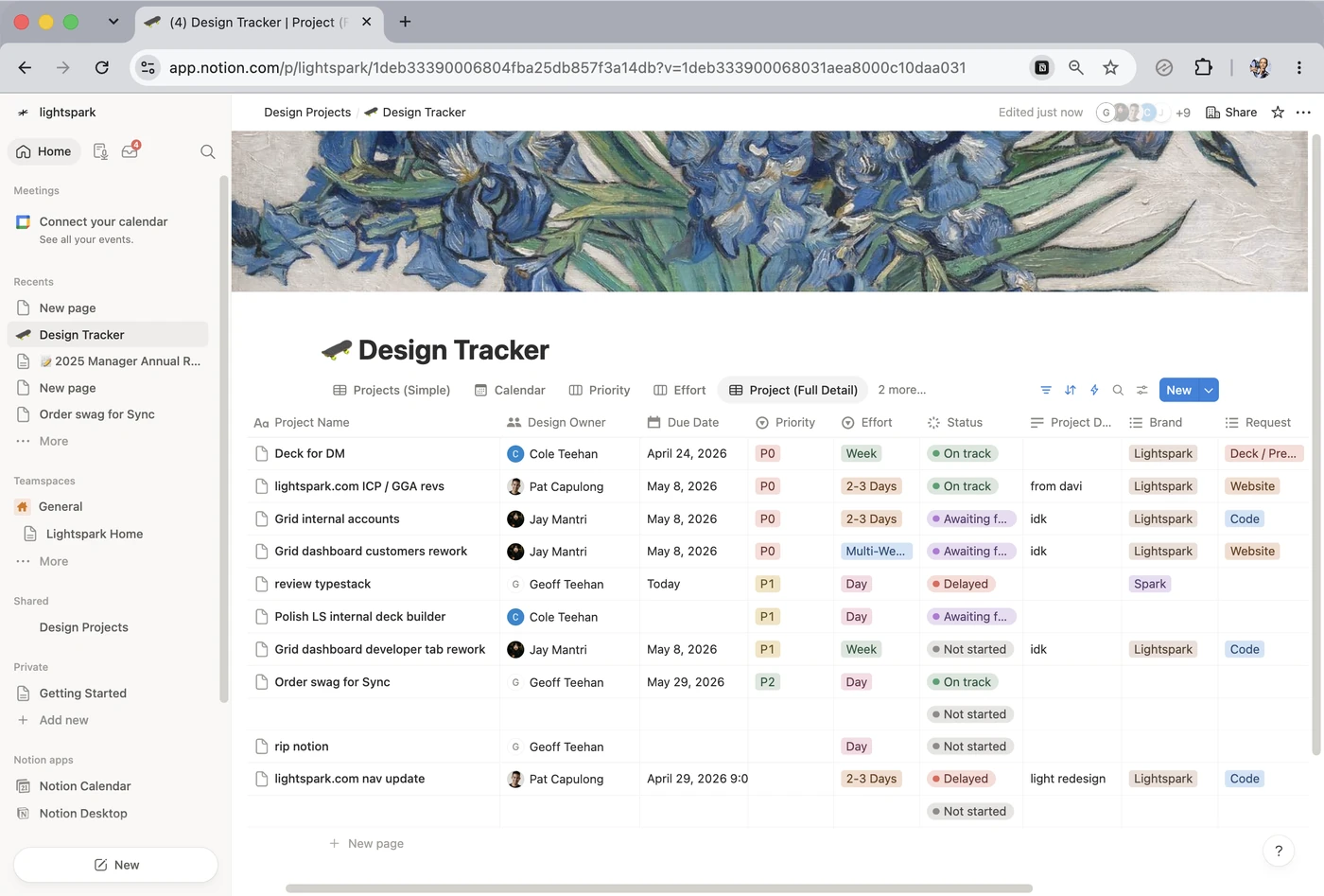
Later, the company started using Notion, so we moved the list there too. We were hesitant because even a fairly simple Notion database felt like more than our meeting needed. It did the job, though, and was nowhere near as heavy as what came next.
Notion
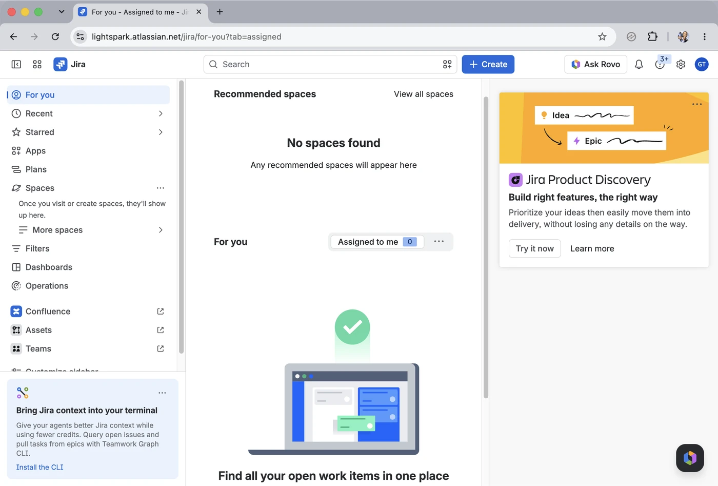
As Lightspark grew, the company moved to Jira. There were good reasons for it. The rest of the company was solving problems much bigger than our design sync, and people needed software that could handle them.
Jira
The jury’s still out on that last part.
From the moment we opened it, it was clear this was way too much for us. Moving from the Sheet into Notion had been a slight improvement, even with some extra overhead and features we’d never touch. This was a behemoth. You could tell from the sign-up alone that it was never going to be software we used. Everything was loud, busy, and complicated. Powerful? Probably. But it was the opposite of what we needed.
For five people talking about a handful of projects, it felt like operating heavy machinery. There were views, configurations, workflows, and plenty of structure we didn’t need. We never got far enough to set it up for the design team. It felt like a fool’s errand. We’d spend a bunch of time configuring it only to create more friction between us and the work.
One of the things I like about working here is that a company-wide tool doesn’t mean every team has to force every job into it. If something gets in the way, you’re trusted to do something else and still be a good partner to everyone around you. For us, that meant making something as simple as the Sheet, but specifically for this meeting: fewer options, no setup, and none of the flexibility we didn’t need. Coding our own felt easier than configuring somebody else’s, so that’s what we did. We called it Rows.
Most of the work came after it worked
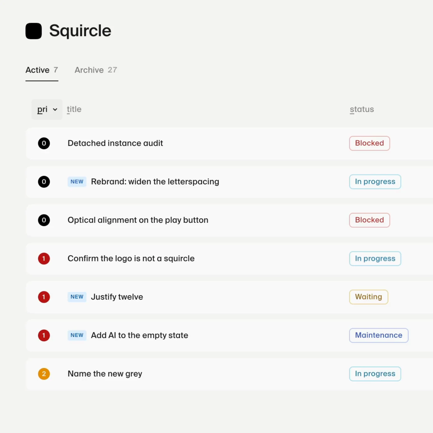
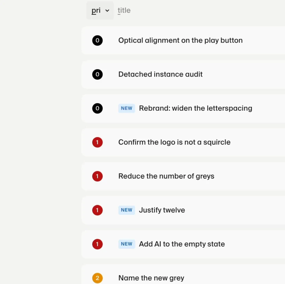
We didn’t have to invent the structure. The Sheet and Notion had already taught us what the meeting needed: a shared list, a few columns, filters, and an archive. The first version of Rows carried that over and left out everything we never used. It worked well enough to open the next morning, which was the point. It was also vibe coded and felt like it. Things jumped between states, the wrong information sometimes appeared while data loaded, and some of the animations were more enthusiastic than useful. A detail that was fun once could become irritating by the twentieth time.
Opening it most mornings meant we kept running into whatever was wrong. We simplified the layout, tuned the motion, fixed how expanded rows updated, made notes and dates easier to use, and got it working properly on a phone. Those are only a few of the hundreds of changes. Put the first version beside Rows today and you can still see the same product. The difference came from correcting it as we used it.
The irony isn’t lost on me that we built Rows to spend less time tracking work, then spent a decent amount of time on the tracker itself. It’s been a fun project and a welcome break from some of the other work we do. A lot of it happened while we were doing other things. We’d leave an agent working in Cursor, check back, steer it, then return to whatever else was on our plate. It still took time and judgment, but it rarely meant putting everything else down.
Compare the first version to the current iteration
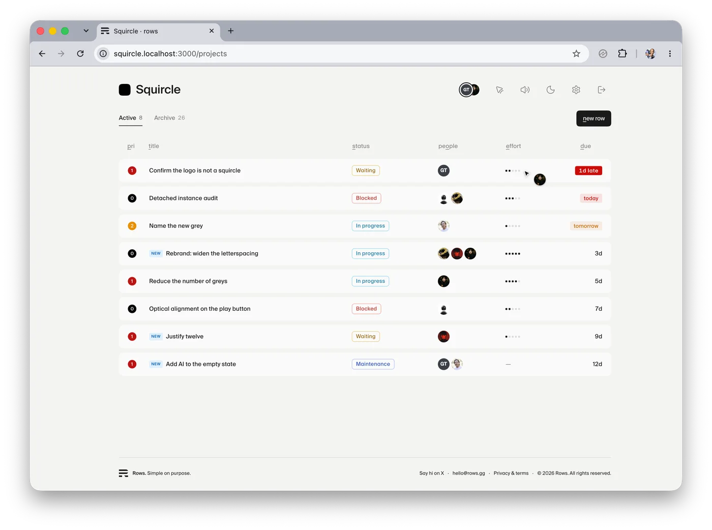
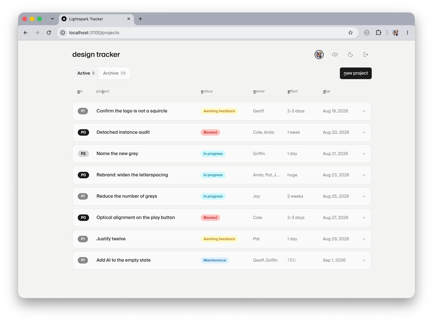
The Figma file is empty
The only part of Rows designed in Figma is the logo. A few screenshots of builds ended up in the file when we wanted to mark something up, but there’s no product design in there. The decisions were made in the working product.
As Pat likes to say, Figma has become a sketchpad for us. We use it when it’s the fastest way to think, explore, draw, or communicate. Rows went straight into code because so much of its design is in how it behaves. A join sound that feels nice when one person arrives can become ridiculous when five do. A live cursor only works if it stays attached to the right project while everyone sorts the workspace differently. An edit from someone else should appear in an open row without making you close and reopen it. We needed the product running with real data and other people in it to judge any of that. Code is the source of truth.
Boring parts can still be fun
Rows is a shared list. You add a project, give it a priority, status, and owner, move it around, and eventually finish it. Pretty boring stuff.
Completing and killing are two moments where we stopped trying to be restrained. Finishing something deserves a small celebration. Killing a project practically asks to be burned down. We pushed both further than necessary and gave them sounds while we were at it. Is it over the top? Absolutely. We use Rows nearly every morning. A couple seconds of nonsense is welcome.
Kill and Complete
Moving rows
Light and dark
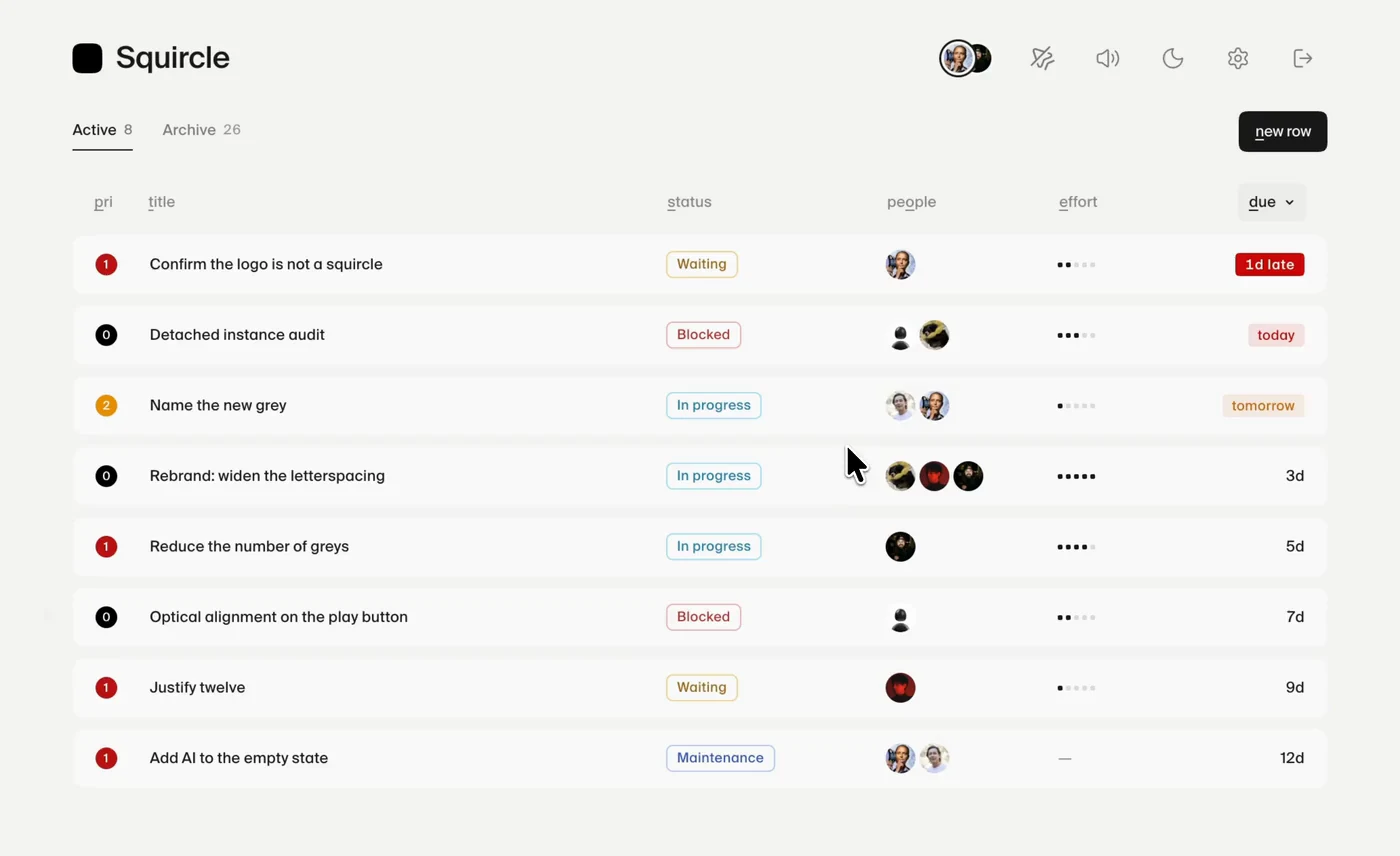
The quieter details came from the same place. During sync, the useful thing about a due date is usually how many days are left, so that’s what Rows shows. Hover for the actual date and click to change it. Keyboard shortcuts sit inside column labels, and the Active and Archive counts roll to their new values rather than pop. Small stuff, but this is what you start noticing when you open the same tool every morning.
Nicer with other people in it
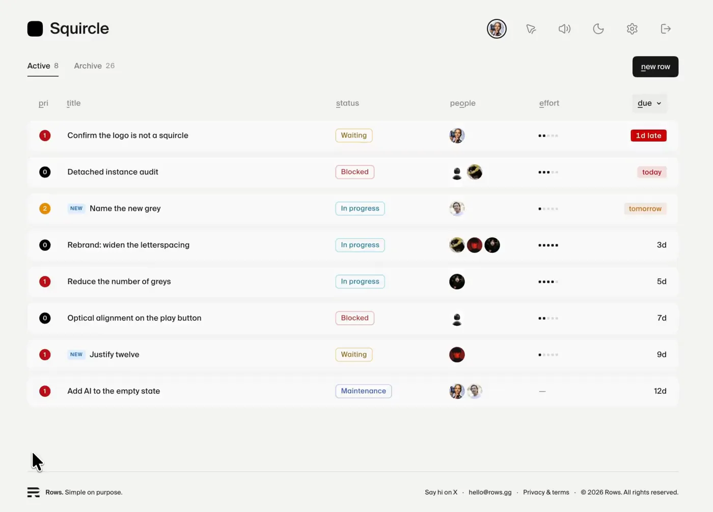
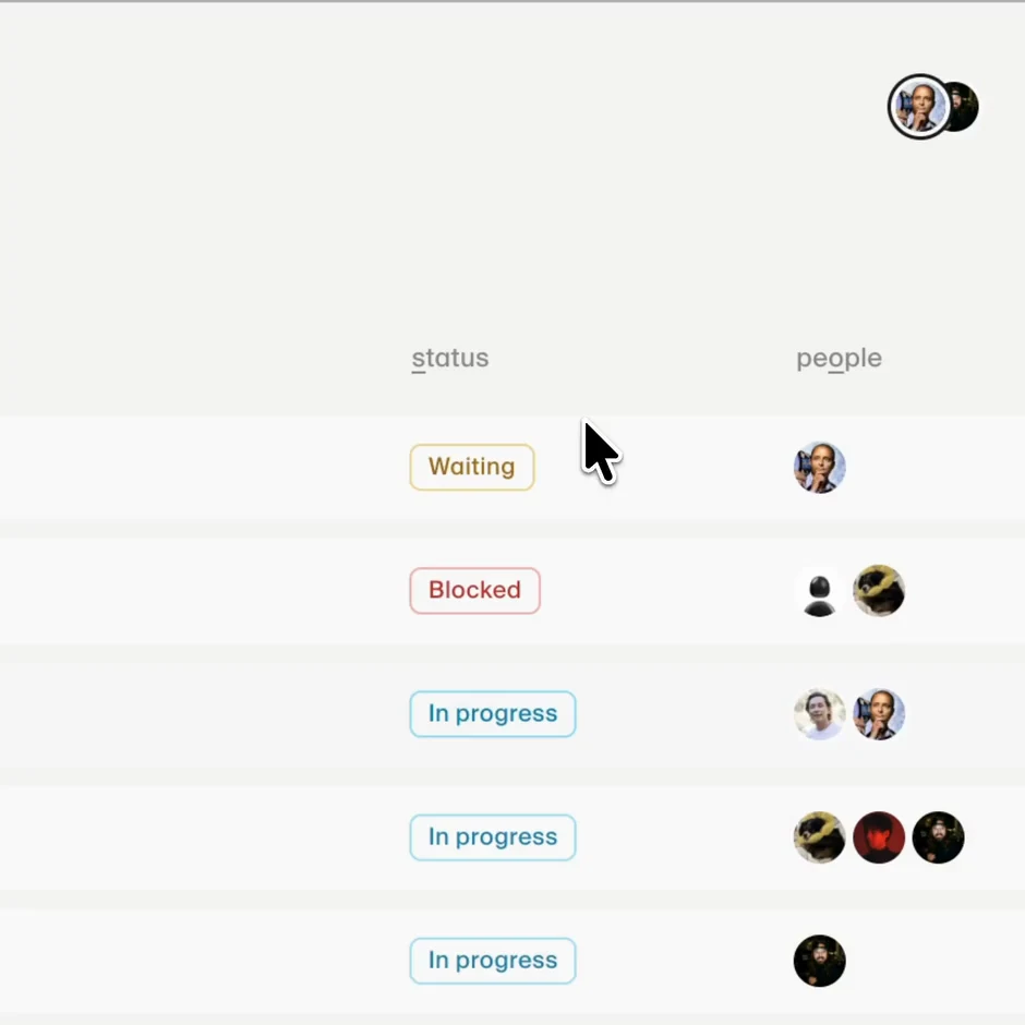
Everyone in a workspace shows up as a cursor with their initials or a profile picture pulled from X or GitHub. You can watch a teammate drift toward a status, hover, reconsider, and commit. Riveting television. During design sync, though, we’re usually on Zoom looking at the same list, and the cursors give the workspace a little presence. You can see where someone’s attention is, watch everyone gather around the same project, or watch two people chase each other instead of discussing the work. It’s not collaboration infrastructure. It’s just nicer when other people are actually there.
Making that work created a problem we could’ve avoided by not building live cursors, but here we are. Everyone can sort the workspace differently on their own screen, and changing one person’s sort shouldn’t rearrange it for everyone else. Sending a cursor’s screen position would put it over a different project for each person. Instead, Rows attaches the cursor to the project and column underneath it, then figures out where that belongs on everyone else’s screen. Point at a project and everyone sees you pointing at the same one, no matter how they’ve sorted things.
Live cursors
Sometimes we ship during sync
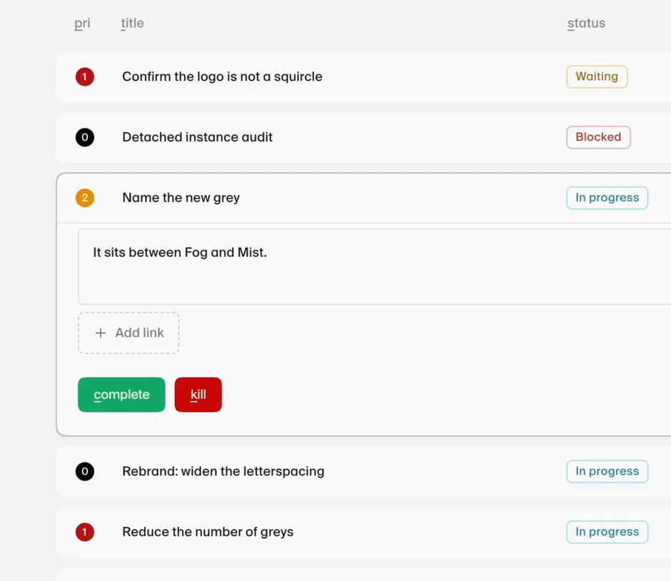
During one design sync, Pat was editing a note and tried the keyboard shortcut for strikethrough. Nothing happened because we hadn’t built it. A couple of minutes later, it was working in production.
Moving that quickly also makes it easy to ship something stupid. We’ve done that too. The upside of using Rows ourselves most mornings is that bad ideas don’t get much time to hide. Something feels wrong, we change it, and sometimes we change it back. Occasionally, all of that happens before sync ends.
Notes
Maybe someone else will find it useful
Rows started with five people and one meeting. It didn’t need to account for every team, workflow, or edge case. We knew the people, the language, and how the meeting worked. If something was confusing, the person who built it was probably already in the room. We could keep exactly what we needed and leave everything else out.
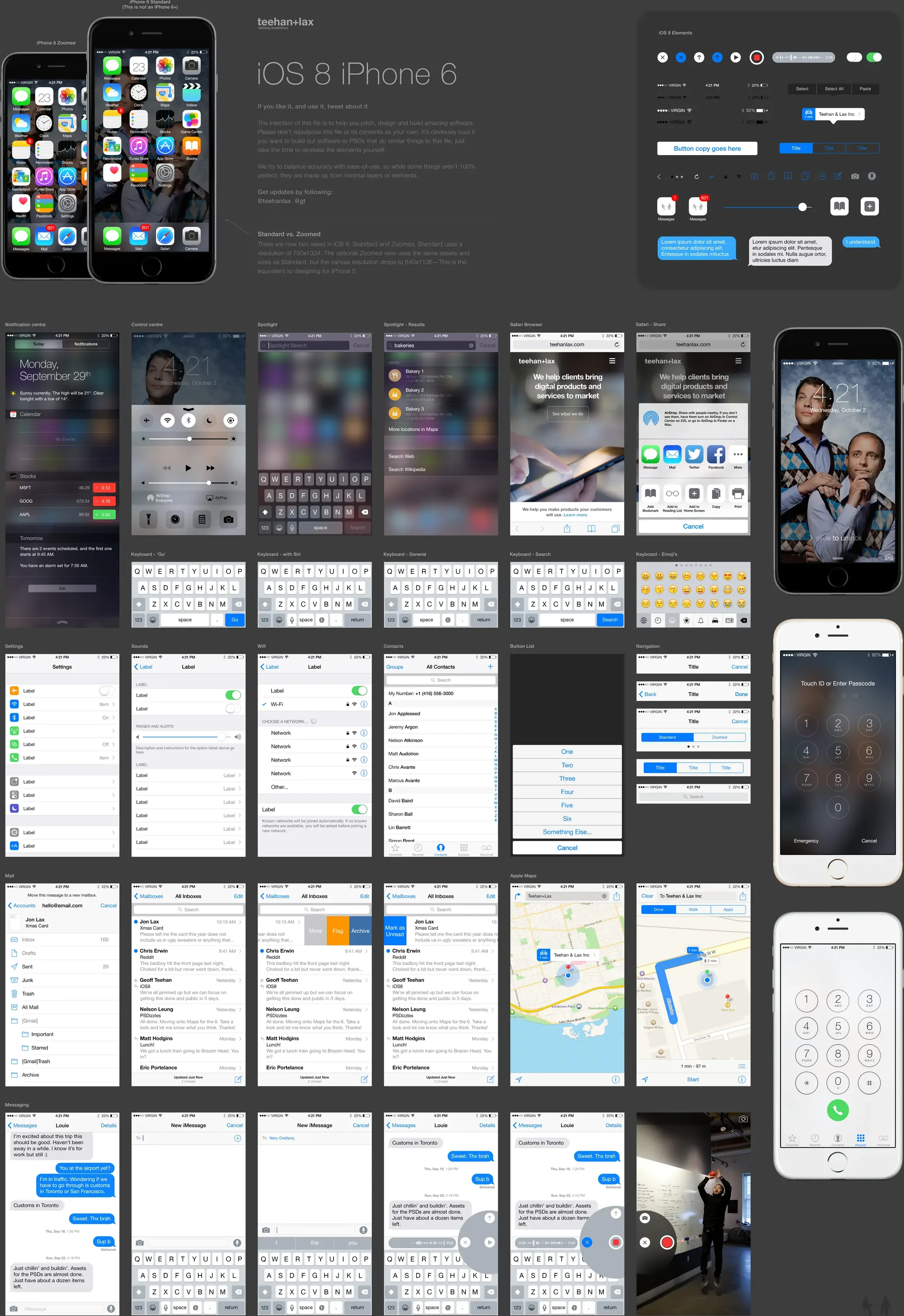
Once it worked for us, sharing it felt worth trying. I’d seen that happen before at Teehan+Lax with the iPhone GUI PSD. We made it because we needed it, then put it online in case someone else did too. Rows is a much smaller and completely different kind of thing, but it comes from the same instinct. We had no idea whether anyone else would want it. It worked for us, so we decided to share it.
The iPhone GUI PSD
Free still has to work
Rows could be a little loose when only five of us used it. If something broke, we fixed it the next morning and everyone knew what had happened. That stopped being good enough once other people started putting real projects into it. Rows is free, and we don’t know what it becomes or how much time we’ll keep putting into it. But while people are using it, it needs to be dependable.
Turning an internal tool into a product meant building a lot around the little list we already had. Other teams needed their own subdomain and workspace. Rows had to work on a phone, explain itself to someone arriving alone, recover passwords, protect people’s privacy, delete their data when asked, enforce sensible limits, and survive an update without silently eating someone’s work. The tracker itself turned out to be the easy part.
More recently, we let agents read and update a workspace through MCP. That sounds like one feature. It meant scoped tokens, permissions, validation, rate limits, and making sure an agent’s changes appeared properly for everyone else. None of that is especially interesting until it goes wrong.
Without all of that, Rows would still be an internal tool with a public URL.
A link, a password, and you’re in
We did keep one part unusually light: getting teammates into a workspace. Rows assumes it’s shared by a small group of people who already know and trust one another. The person creating it chooses a subdomain, adds everyone’s names, sets one shared password, and sends the link and password to the group. That’s the whole setup.
Creating a workspace takes less than a minute
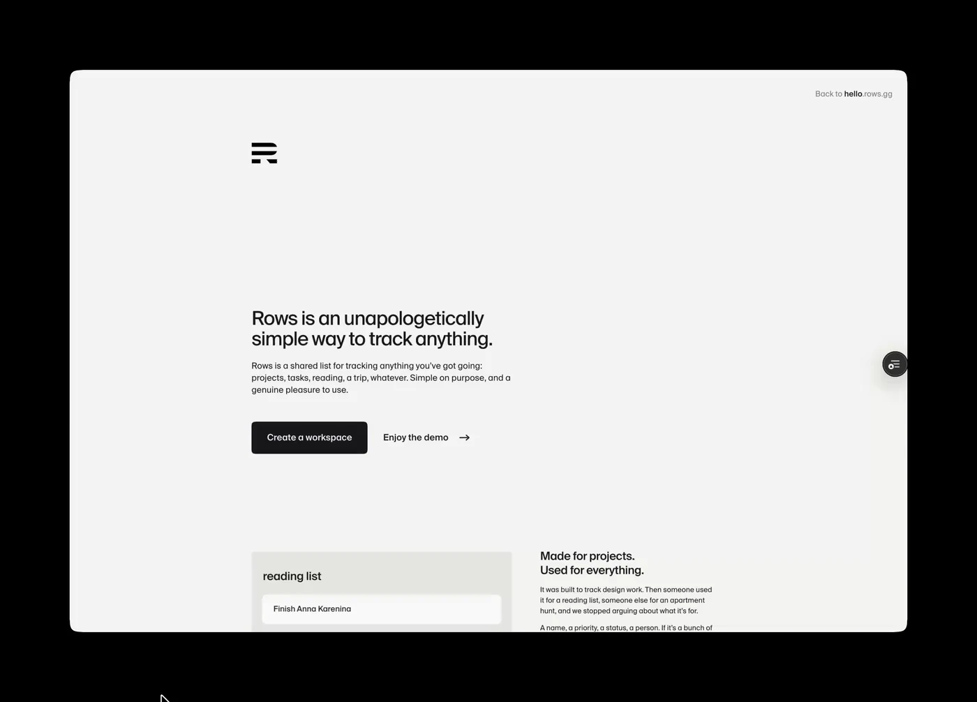
When a teammate arrives, their name is already waiting. They enter the password, pick themselves, and they’re in. No email invitation to find, individual account to create, or verification code to enter. They can use their initials for an avatar, upload an image, or pull a profile picture directly from X or GitHub. It would be strange for the sign-up flow to be heavier than the product.
A link, a password, and you’re in
Picking a name is enough to get in, but setting a profile is surprisingly fun. Keep the initials, upload an image, or type an X or GitHub handle and watch Rows pull the photo in. It takes a couple of seconds and gives all those nearly useless live cursors a face.
Profile picture
What we used
- Build
- Cursor — where nearly all of the design decisions were made
- Design
- Figma — the logo and a few screenshots marked up for agents
- Models
- Claude Fable 5, GPT-5.6 Sol, Composer 2.5, Grok 4.5
- Agent access
- MCP — letting agents read and update a workspace from outside Rows
- Capture
- Screen Studio — every recording in this post
- Stack
- Next.js — App Router and TypeScript — one app, no separate backend
- Hosting
- Vercel — a workspace is a subdomain; every push is a deploy
- Data
- Postgres
Rows is live at rows.gg if you want to try it.
The job stays small
We’ve put a lot of work into Rows, and we’ll probably keep changing it. Its role in our design sync has stayed small. It remembers what’s moving, where someone might need help, and what we should talk about that morning.
Rows can’t critique someone’s work, recognize when they need encouragement, or create trust between teammates. That comes from the people in the room. Rows holds the list, makes a few boring actions less dull, and stays out of the conversation.
Then we get on with our day.
Comments
Add something we missed, ask a question, or disagree. Just be cool.