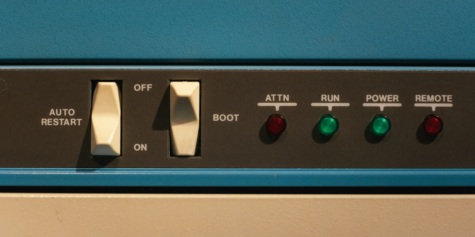
Make every single detail perfect, and limit the number of details.
The first half gets your attention. The second half is what makes it possible. Fewer details allow you to care more deeply about each one.
By details, I don’t just mean the small visual decisions. Every feature, control, mode, state, exception, and bit of behavior becomes something a team has to design and someone has to understand. There’s only so much attention to go around. Same for time, taste, and patience.
A button seems harmless enough, but someone has to decide where it goes, what it says, what it looks like, what happens when you press it, what happens when you can’t, and what happens after you do. Add another and now you don’t just have two buttons. You have the relationship between them.
Nothing terrible happens when you add a third or a fourth. That’s kind of the problem. Keep going and eventually you’re not really designing the details anymore. You’re managing them.
Complexity is a tax on craft.
Less, but better
Dieter Rams famously described good design as “less, but better.” We’ve spent a lot of time talking about the less. The better is more interesting.
Two of Rams’ principles say that good design is thorough down to the last detail and that good design is as little design as possible. Look closely at a Braun radio and you can see how those ideas work together. There isn’t much there. A few controls. Some type. A speaker grille. So the things that are there get to matter a lot.
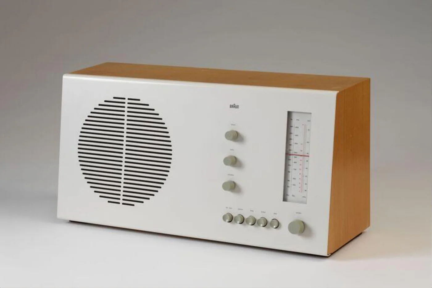
The diameter and resistance of a knob matter. So does the distance between two controls, the weight of a line, and the click of a switch.
Give someone three knobs and they can spend six months making three excellent knobs. Give them thirty and you’ve probably invented enterprise software.
Three isn’t inherently better than thirty. Attention just doesn’t scale with the number of knobs.
A thousand songs
The original iPod is one of the clearest examples of this.
Putting a thousand songs in your pocket was not a simple problem. It was a huge increase in complexity. Apple could have put that complexity on the surface. Instead, much of the interaction got concentrated into a circle.
A thousand songs. One primary control. That control had to be incredibly good.
Its diameter, position, acceleration, stopping, and tactile response all had to feel right. There was still a ton of complexity underneath, but with so much of the interaction running through one wheel, Apple could obsess over how that wheel worked.
They weren’t reducing things for the sake of it. Fewer things meant more attention for what remained.
Four knobs
The Teenage Engineering OP-1 is a useful counterpoint because nobody could reasonably accuse it of not doing enough.
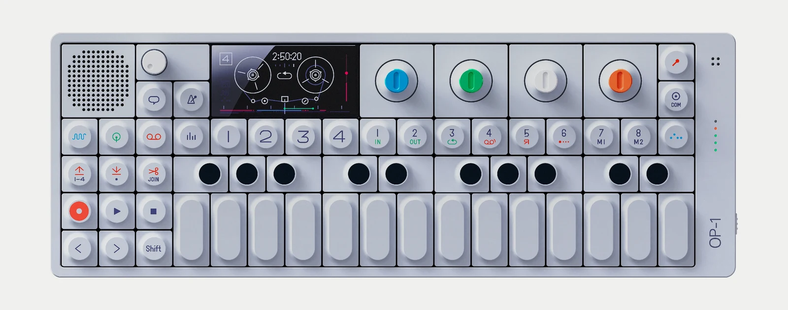

It’s a synthesizer, sampler, sequencer, tape recorder, and mixer. A strange little machine that does a ridiculous number of things.
The OP-1 is not simple to use. Nobody picks one up and immediately knows how to record a synth, sample it, sequence it, bounce it to tape, and mix the result. You can’t bluff your way through all that because the knobs have nice colors. It’s an instrument, and instruments take time to learn.
It’s closer to a tiny cockpit than a toaster. The stakes are lower, obviously, but learning is part of the deal. Given everything inside it, the remarkable thing is how much worse the interface could have been. A more conventional version might have covered every available surface with controls, labels, menus, and modes.
Instead, four colored encoders do much of the work. They change jobs depending on where you are, but color keeps the relationship clear. Turn the blue knob and the blue thing on the screen changes. Turn the green knob and the green thing changes. Four knobs become a language.
Look at the tape screen running above. Two reels, four tracks, and a counter ticking off twenty-four frames to the second. The whole recorder is drawn with almost nothing.
You still have to learn it. The difference is that the learning feels contained. Four knobs, colors that mean something, and a system that eventually starts to make sense. For a machine this capable, that may be as simple as it gets.
Pull the cord
Naoto Fukasawa designed a CD player for MUJI that hangs on a wall with a cord beneath it.
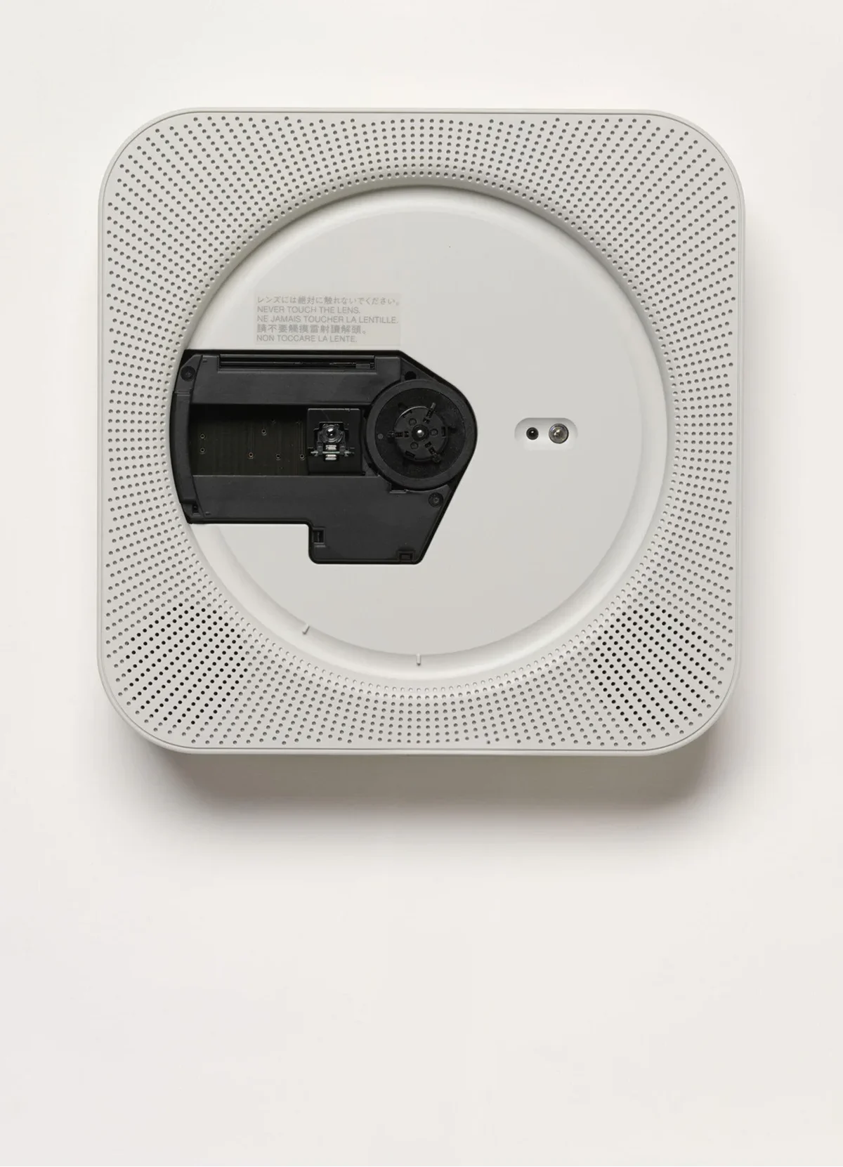
Pull the cord. The CD spins. Music plays.
The player has other controls, but its central interaction borrows from something almost everyone already understands: a ceiling fan or a pull-chain light. Pull the cord and the thing turns on.
What makes it good isn’t that it looks minimal. The idea itself is small. There’s almost nothing to explain because there’s almost nothing to misunderstand.
That’s much harder than making a white rectangle with one button on it.
Software has a problem
Physical products make complexity expensive. Every knob costs money. Someone has to manufacture it, wire it, assemble it, test it, put it in the box, and ship it halfway around the world.
Software has no such decency.
Another button is basically free. Another tab? Sure. Setting? Why not. Preference? Menu item? Mode? Dropdown? Stick it under Advanced.
And so software accumulates.
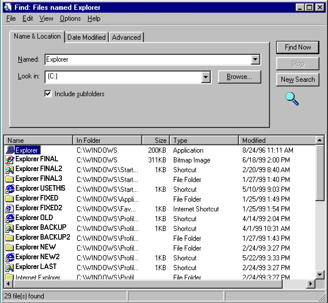
The cost doesn’t show up on a bill of materials, but it’s there. Every new detail has to coexist with everything that came before it. It needs a place in the hierarchy. It creates another decision, state, exception, thing someone has to understand, and thing someone has to maintain.
A button isn’t really one button. It’s a small mortgage. You can be paying interest on that thing for years.
That doesn’t make complexity bad. Photoshop is complicated because Photoshop does an extraordinary number of things. Although fifteen years ago I would have said that without hesitating, and now I need a minute.
A 747 cockpit has a lot of controls because landing 400 people in a machine weighing several hundred thousand pounds is, apparently, somewhat involved.

Complexity can be worth it. It should just have to earn its way in.
A 747 cockpit is allowed to look like a 747 cockpit. Your thermostat probably isn’t.
The car is the cautionary tale
I wrote about this at length in 2014, in a fairly cranky piece called The State of In-Car UX. The complaint wasn’t that cars had screens. It was that the screen had quietly become the place every function went to live.
The number I kept coming back to was more than 800. That’s how many functions the center console of the Porsche 918 Spyder was reported to control. The car started at $845,000. In the interior photo, the typeface on the touchscreen didn’t match the selector directly beneath it, and the selection state was green on one and orange on the other.
Nobody sat down and designed 800 functions as a system. They arrived the way they always do, one reasonable request at a time, until there was no surface left that could hold them and no one left who could hold them all in their head.
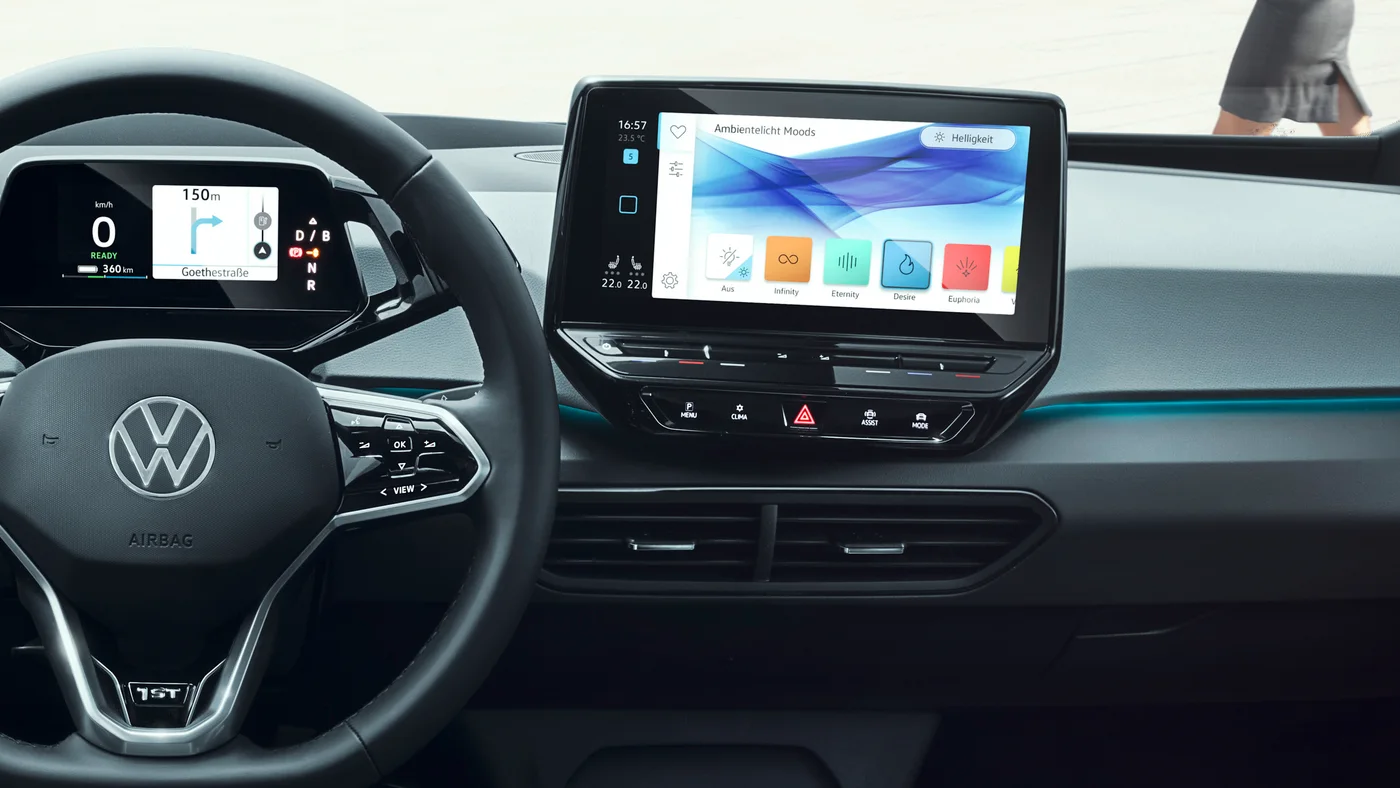
I assumed this would get better. Design was maturing, Apple and Google were arriving, and the hardware was going to stop being embarrassing. Some of that happened. The screens got faster and much prettier. Then manufacturers discovered they could delete the buttons too, and the interface swallowed the climate controls, mirrors, vents, and glovebox.
ID.3, 2020
ID. Polo, 2026
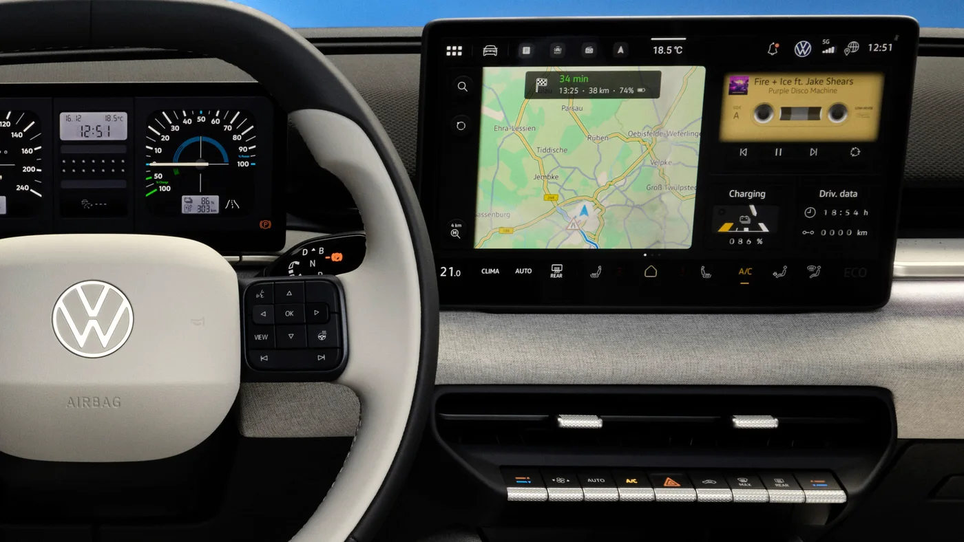
Volkswagen has since admitted this was a mistake. Its design chief, Andreas Mindt, put it about as plainly as a car executive can:
We will never, ever make this mistake any more. Honestly, it’s a car. It’s not a phone: it’s a car.
Buttons are coming back for volume, heating, fans, and hazards. The screen isn’t going anywhere; there are still too many other functions to put somewhere else. Mindt’s point is that the five things people use most should always have a physical place.
Choosing the five is the hard part. The Porsche still had more than 800 functions regardless of where they lived. Moving them behind glass cleaned up the console, but it didn’t make the car simpler. It made some things harder to find, often while driving.
A clean surface photographs well. At 70 miles an hour, finding the fan matters more.
Success makes this harder
Cars accumulate complexity where everyone can see it. Software tends to do it quietly, one roadmap item at a time.
The first version of a product does one thing and usually does it pretty well. Then people use it, which is unfortunately where the trouble starts.
People want things. Teams get bigger. Customers ask for features. Competitors ship things. There are quarterly goals. Someone discovers a new market segment. Someone else has a partnership. Eventually someone says AI.
Most of these requests make sense on their own, which is exactly the problem. Nobody wakes up and says, “Let’s make this product substantially worse over the next five years.” It happens one perfectly reasonable decision at a time.
iTunes 1
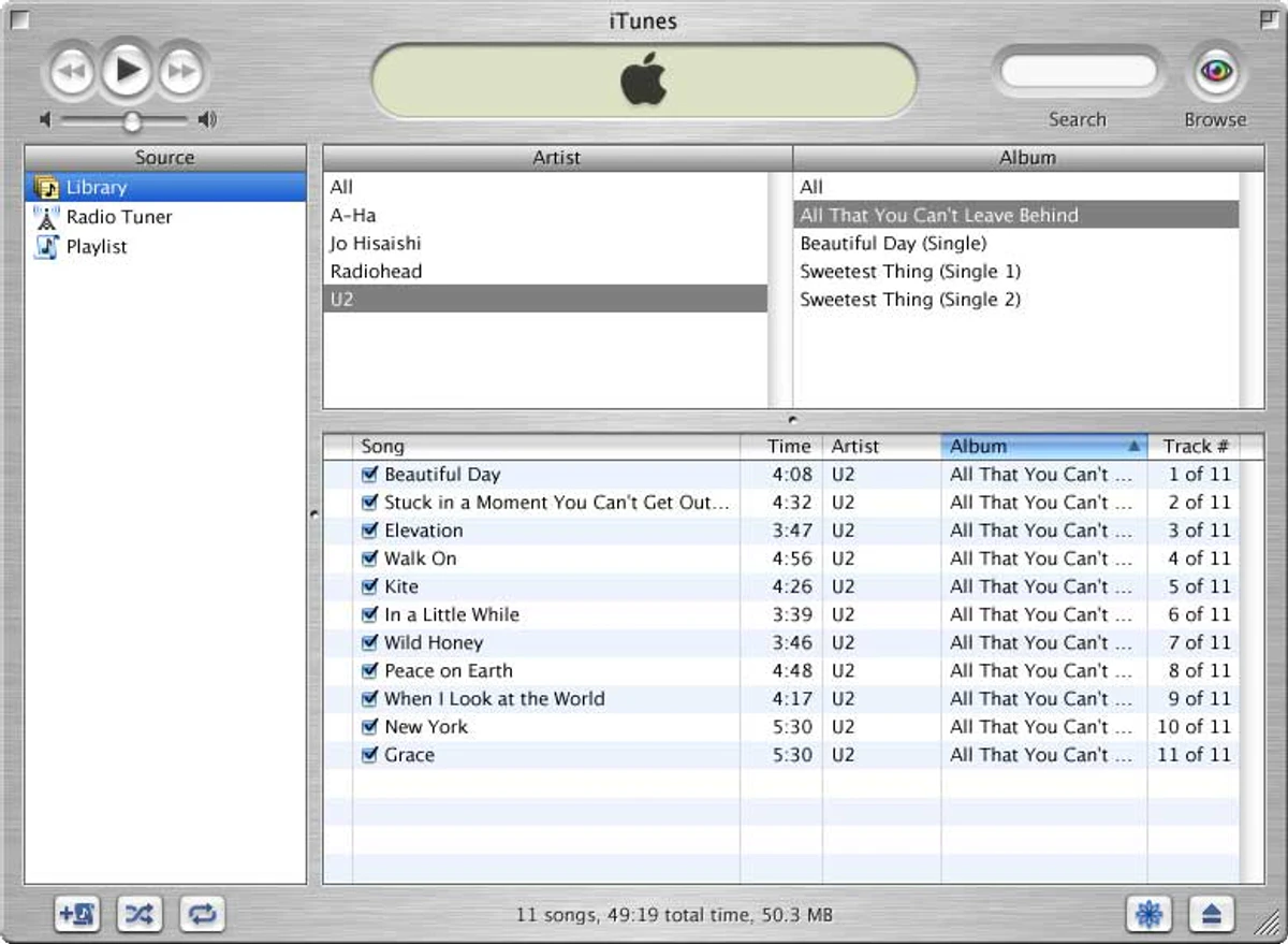
iTunes 12.9
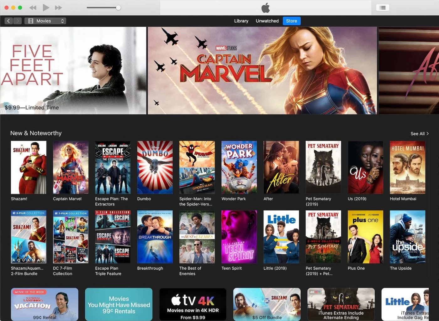
Eventually the original product is still in there somewhere, like a nice little house that has had twelve additions built onto it. You can probably find the kitchen if you remember where it used to be.
This is also why removing things is so hard. Adding something usually has an advocate. Removing something has an enemy.
What you get back
Removing something gives you time back. Time to reconsider the typography, rewrite three words, make an interaction feel right, move something two pixels, tune the sound, or notice what becomes annoying after the twentieth use.
Most people won’t notice any of it. Fine. They shouldn’t have to.
Minimalism isn’t the point. You can make something sparse and still make it bad. The goal isn’t to have the fewest things. It’s to have few enough things that you can care deeply about every one of them.
Make every single detail perfect. Limit the number of details.
Comments
Add something we missed, ask a question, or disagree. Just be cool.